
Improved dropdowns, country inputs and more
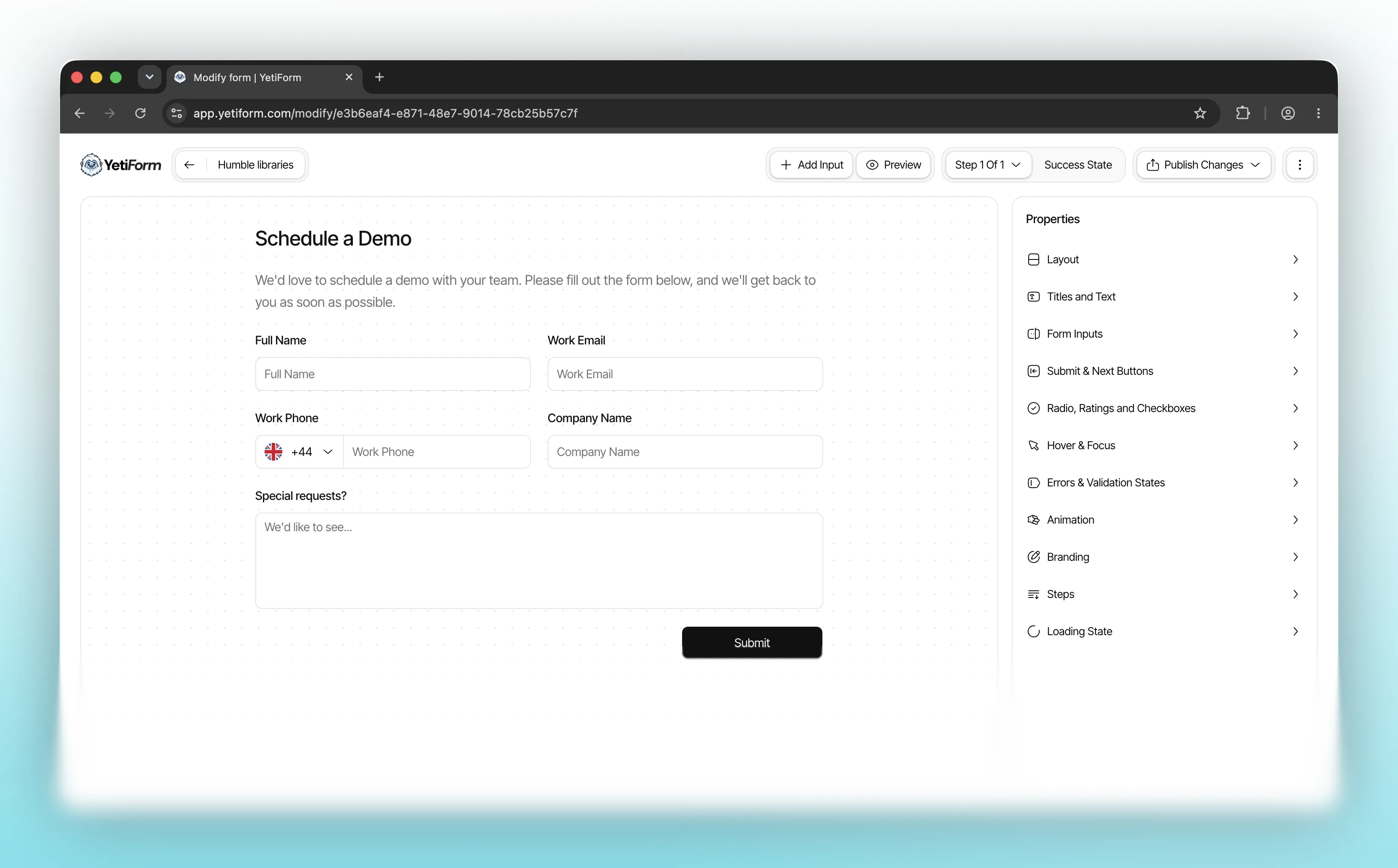
We’ve made several improvements to the way you build and style forms in YetiForm. Dropdown fields now use a custom menu with clearer hover and selection states, giving people a more consistent experience across your forms.
Phone number fields now start with a country flag and dialling code. Open the selector to search by country or code, then choose the right option from the list. Country dropdown fields also show flags, making options easier to recognise at a glance.
You can customise the background colours used when someone hovers over or focuses a dropdown option. The same hover and focus styling controls apply to the country selector, so these menus can match the rest of your form.
We’ve added numbered and recommendation scales for collecting ratings and feedback. You can set the scale’s range and the labels at either end, while its selection states inherit your form’s existing colour and animation settings.
Forms can now include standalone text and paragraph blocks alongside input fields. Edit their content, alignment and padding to add context wherever it is needed. Buttons have alignment controls too, and we’ve tightened the spacing around text blocks in the editor and published forms.
These improvements are available in the form builder now. Open an existing form or start a new one to try them out.